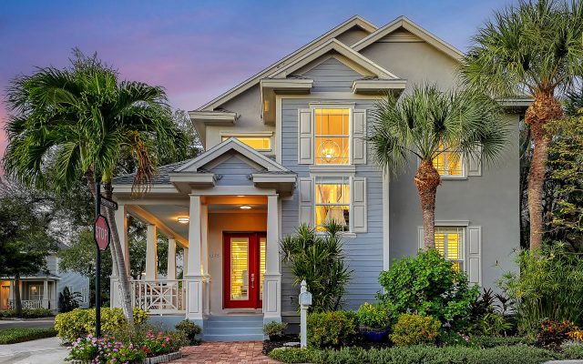
What are the trending colors of the year? Paint manufacturers explore design, art, fashion, cultural and environmental influences around the globe to select a color of the year that balances modern-day relevance with long-lasting appeal. With spring comes the promise of a fresh start—and maybe a fresh coat of paint. If you’re thinking of re-painting your Sarasota Luxury home, here’s a photo overview of the leading paint companies’ choices for 2021 color of the year.
Benjamin Moore: Aegean Teal
Take a moment to reflect and reset. Intriguing, balanced, and deeply soothing, the Benjamin Moore Color of the Year 2021, Aegean Teal 2136-40, creates natural harmony.
Sherwin Williams: Urbane Bronze
Tap into nature with a hue for which warmth and comfort breathe down-to-earth tranquility. Sherwin Williams’ 2021 Color of the Year, Urbane Bronze, captures simple sophistication. Urbane Bronze might be a color rooted in nature, but it also has a unique ability to ground a room through organic appeal. Whether it’s accentuating window trims or accent walls, this warm hue draws from nature for a feeling of relaxation and serenity. It also works well with other elements including, light-filled spaces and foliage.
Behr: Canyon Dusk
As part of the Behr Color Trends 2021 Palette, Canyon Dusk’s grounding warmth and reassurance deliver on the color collection’s promise of elevated comfort. Canyon Dusk infuses a gentle note of calm and harmonious escapes throughout the interior or exterior of the home. A sense of belonging that deepens the collective experience, whether exploring the great outdoors or settling into softer moments at home. An atmosphere of warmth that satisfies the shared human desire to discover solid ground on life’s journey.
Pantone: Ultimate Gray + Illuminating
PANTONE Ultimate Gray + PANTONE Illuminating — two independent colors that highlight how different elements come together to support one another — best express the mood for Pantone Color of the Year 2021. Practical and rock solid, but at the same time warming and optimistic, the union of PANTONE Ultimate Gray + PANTONE Illuminating is one of strength and positivity. It is a story of color that encapsulates deeper feelings of thoughtfulness with the promise of something sunny and friendly.
Valspar: Gray-Green Linen
Like the stone elements we rely on for protection from the outside world, this reliable gray gives us a sense of safety and stability. Bring modern elegance to your kitchen cabinets. Add warm brass and wood elements to play off of the subtle green undertones of this stony gray.
Glidden: Aqua Fiesta
Happy and muted, this beautiful color makes a sweet space that is not overly vibrant. Can be used equally well in a bedroom, bath or kitchen for a happy morning experience.

PPG: Transcend, Misty Aqua, Big Cypress
Transcend, Big Cypress and Misty Aqua. Paint colors intended for the person who wants to fully embrace mindfulness and intention, our first-ever Paint Color Palette of the Year showcases natural hues that are comforting, compassionate and optimistic. The color trio celebrates beauty of all kinds and relates to those who prioritize wellness in mind, body and spirit.

HGTV Home: Passionate
Elegant and rich, we’re getting rustic-red-wine vibes from Passionate. As the cornerstone of the collection, Passionate is meant to invigorate our senses (as a glass of red wine can), but also, center us emotionally. Its cozy comfort comes from subtle familiarity: natural, layered and vintage influences.

Graham & Brown: Epoch
The launch of Epoch as color of the Year begins the celebration of Graham and Brown’s 75th Diamond anniversary. The rich, deep amethyst is the key color for 2021 and beyond and fits neatly into our history as amethyst is the birthstone for February. It is also the color associated with royalty as the cost of pigments were so expensive – the color has a calming effect on both the mind and nerves, and it can be uplifting and trigger creativity. Perfect for a lounge, home office or even bedroom.